Typically, clients are most concerned about the contents of the first chart, but the subject matter of the other charts usually aid in painting a clearer market picture, especially the Days on Market Chart.
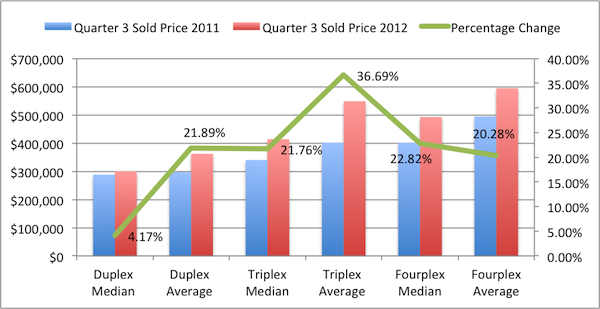
Average and Median Sales Price
The first chart show the average and median sales price for the first three quarters of the 2012 year compared to the performance of the first three quarters of 2011. Overlaid in the green line is the percentage change from 2011 to 2012. You’ll notice that the numbers are significant. There are various factors that could have contributed to this namely the dramatically low interest rates, rise in rental rates, and general incline in consumer outlook. As a practitioner working in the sales of these properties on a regular basis, I definitely see these price increases firsthand. Prices in single family homes also reflect substantial rises in prices as can be seen in our post here.
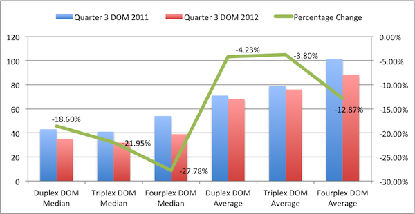
Days on Market
Just as interesting as the rise in prices in the chart above, we see significant drops in Days on Market for properties sold. This also is very evident in our regular sales activities. Properties are selling at a much faster rate than in recent years. Part of this is attributed to accelerated short sale processes but more likely is attributed to the same factors that are causing the prices to rise.
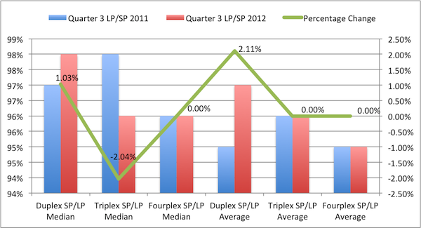
List Price to Sales Price Percentage
Perhaps the least interesting of the 3 charts is the List Price to Sales Price chart that doesn’t show any exciting or conclusive figures.
We hope you found these San Diego County duplex, triplex, and fourplex reports helpful. For further discussion of market activity or help with the purchase or sale of your property, please don’t hesitate to get in touch.
Information gathered from Sandicor. Information is deemed reliable but not guaranteed.


[…] recent reports in further detail. Also, check out our 3rd Quarter Market Reporty for 2-4 Units by clicking here and see how the 2-4 unit market has experienced similarly strong increases. Filed Under: […]